|
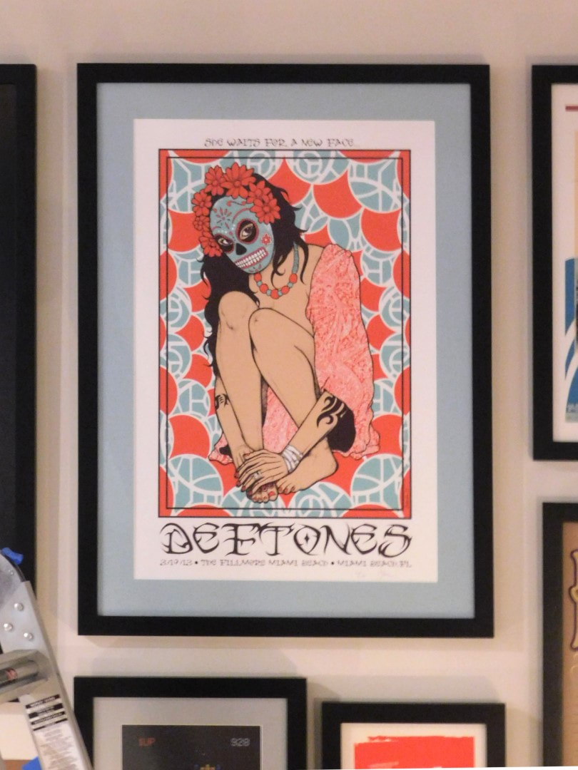
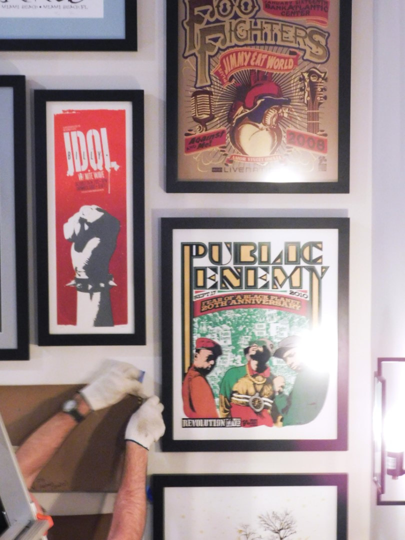
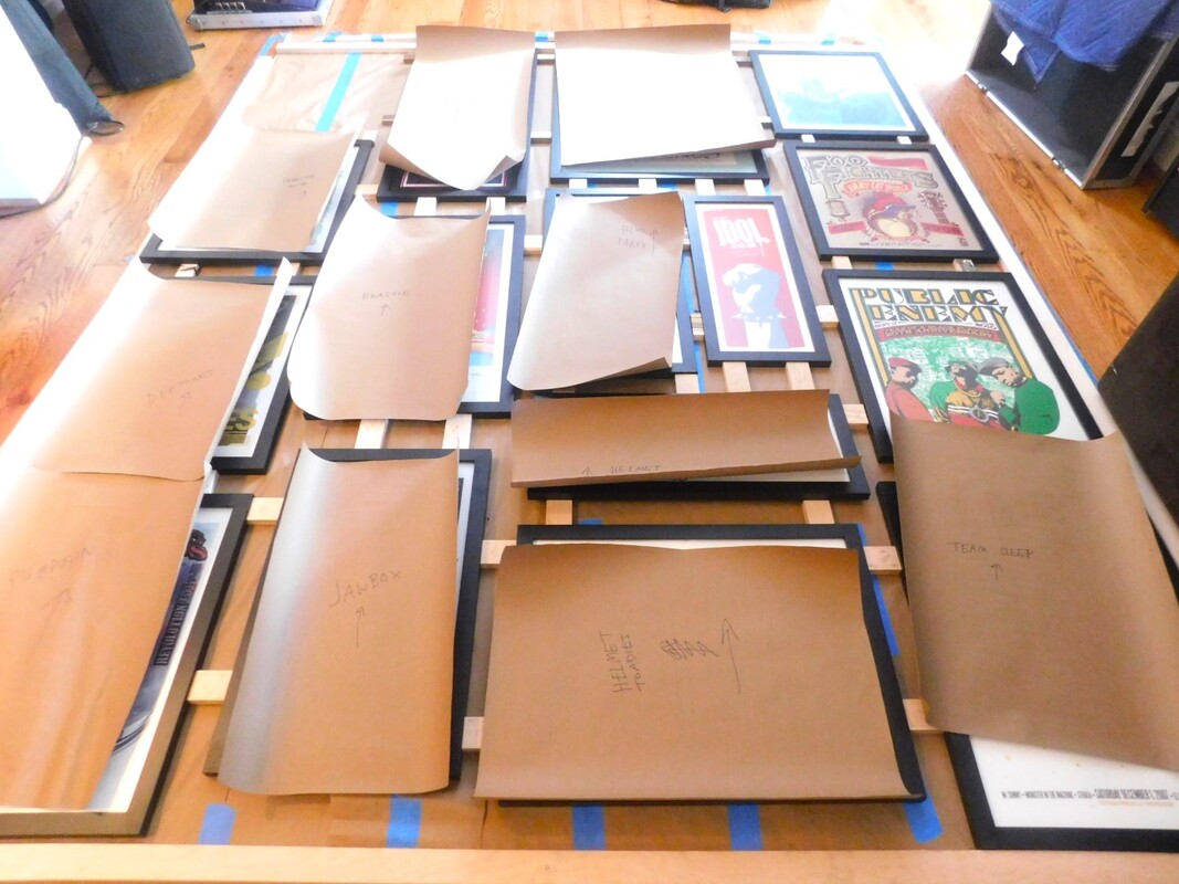
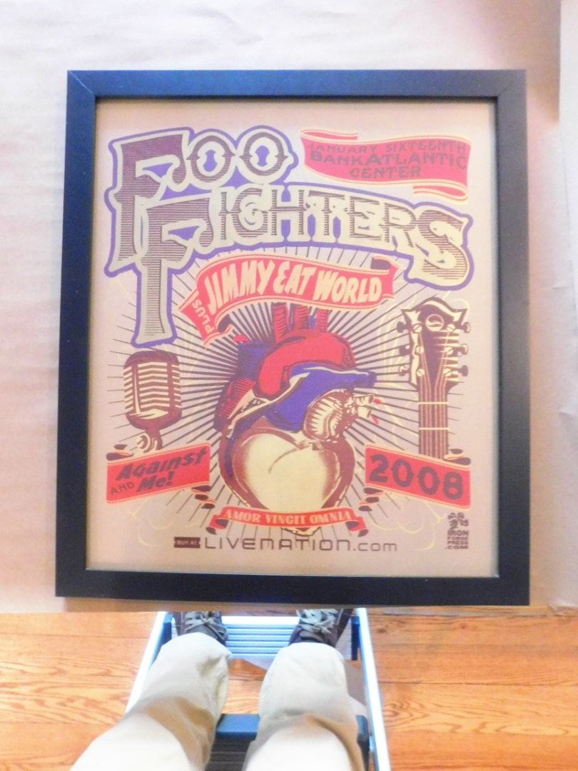
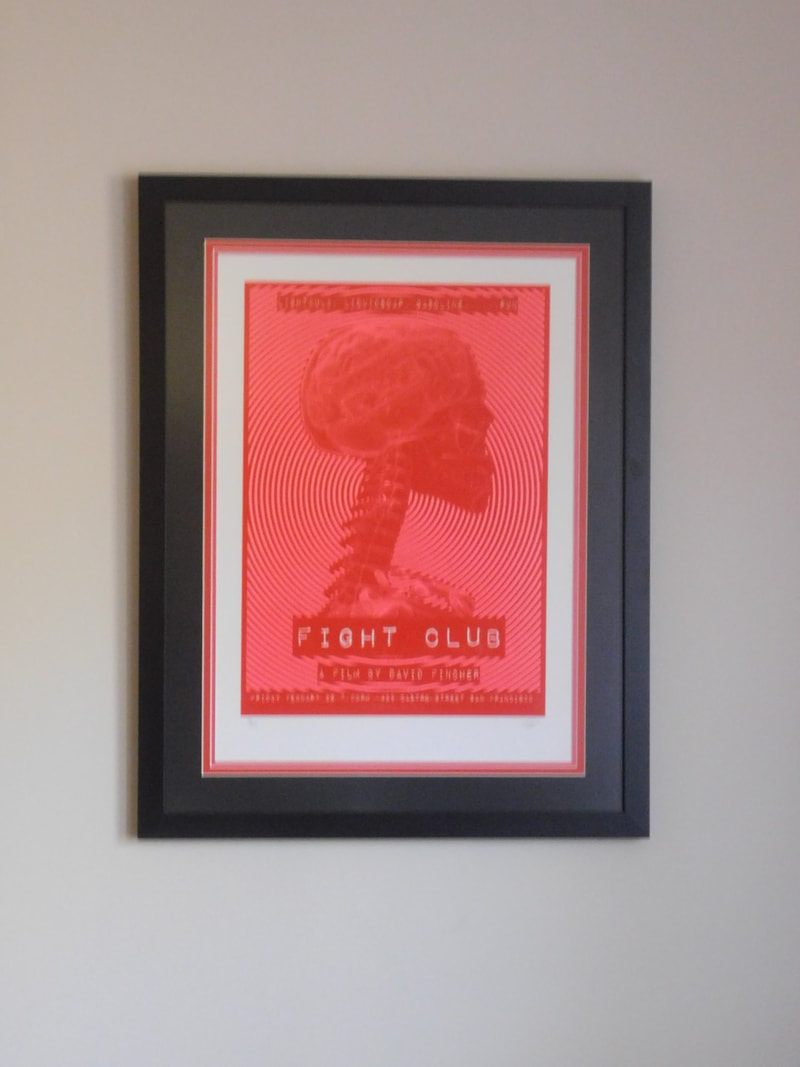
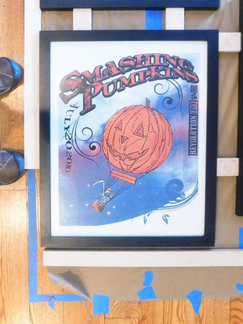
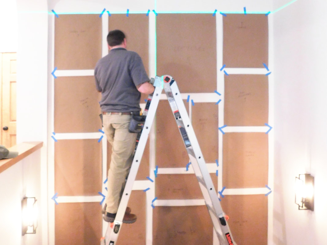
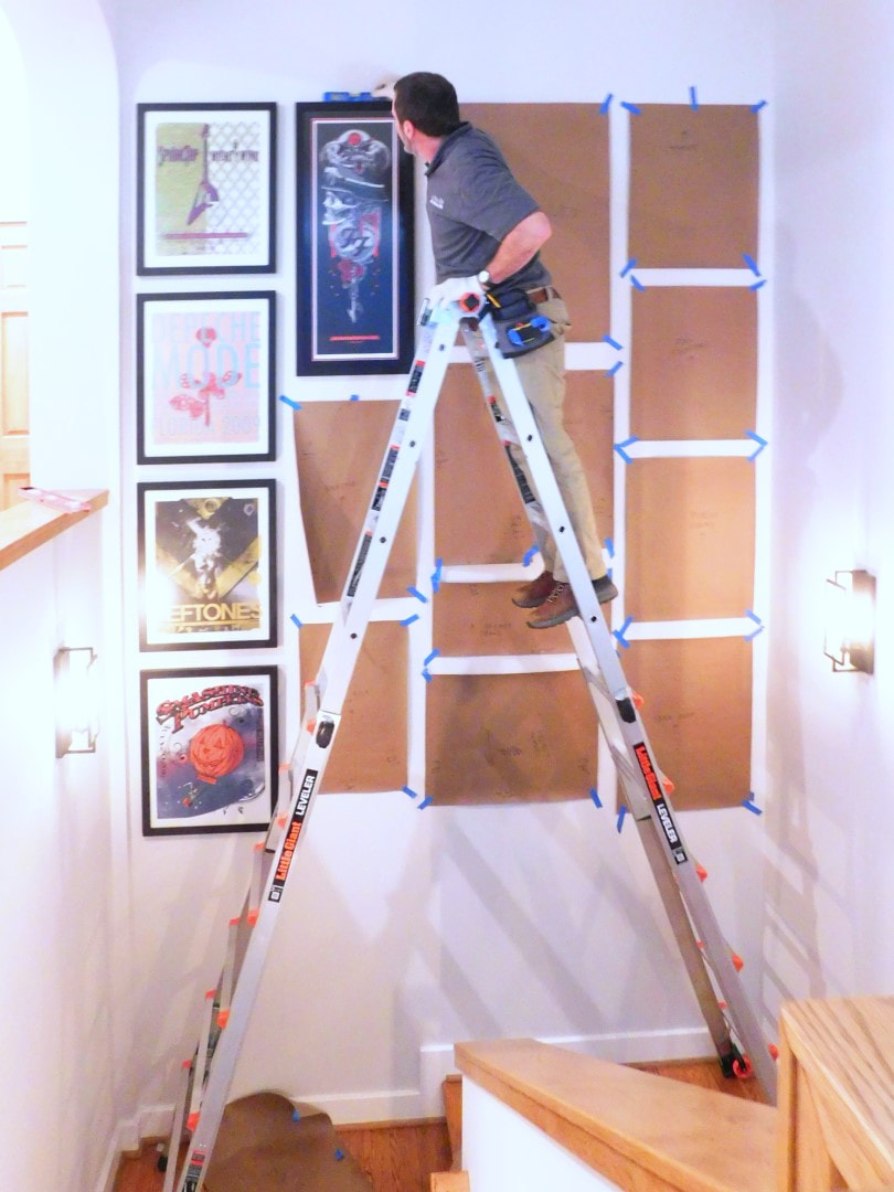
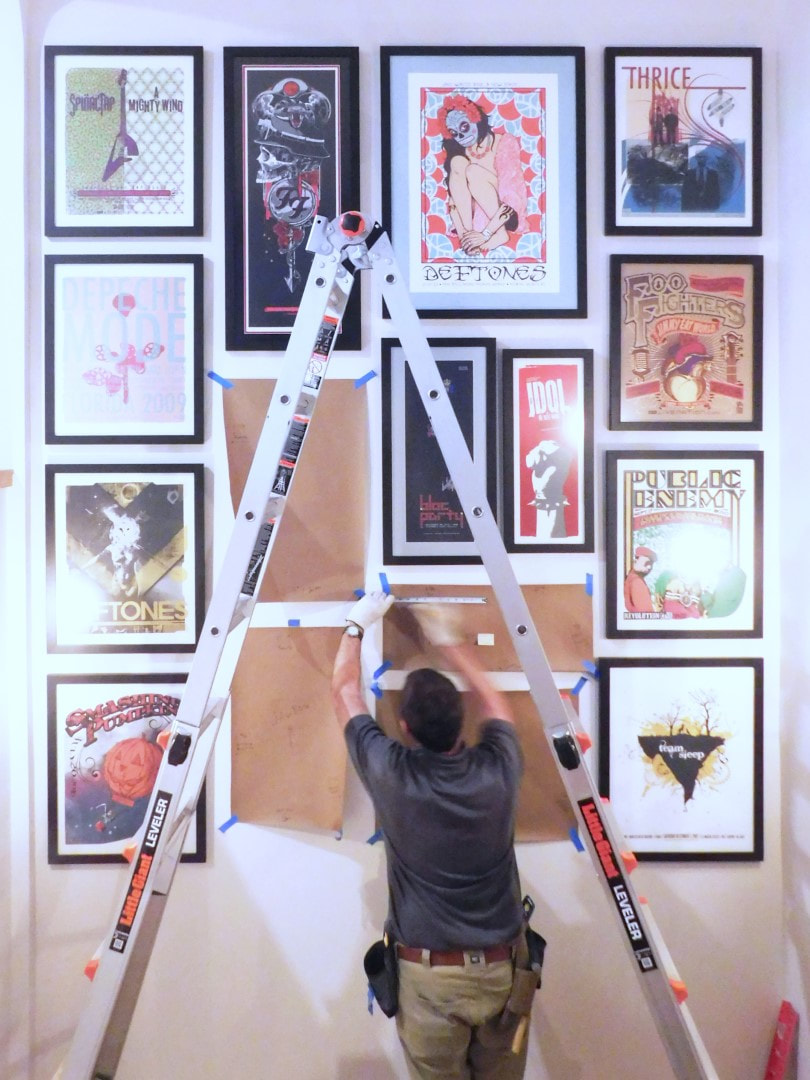
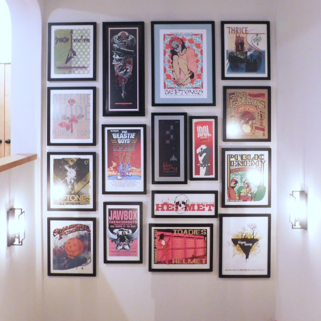
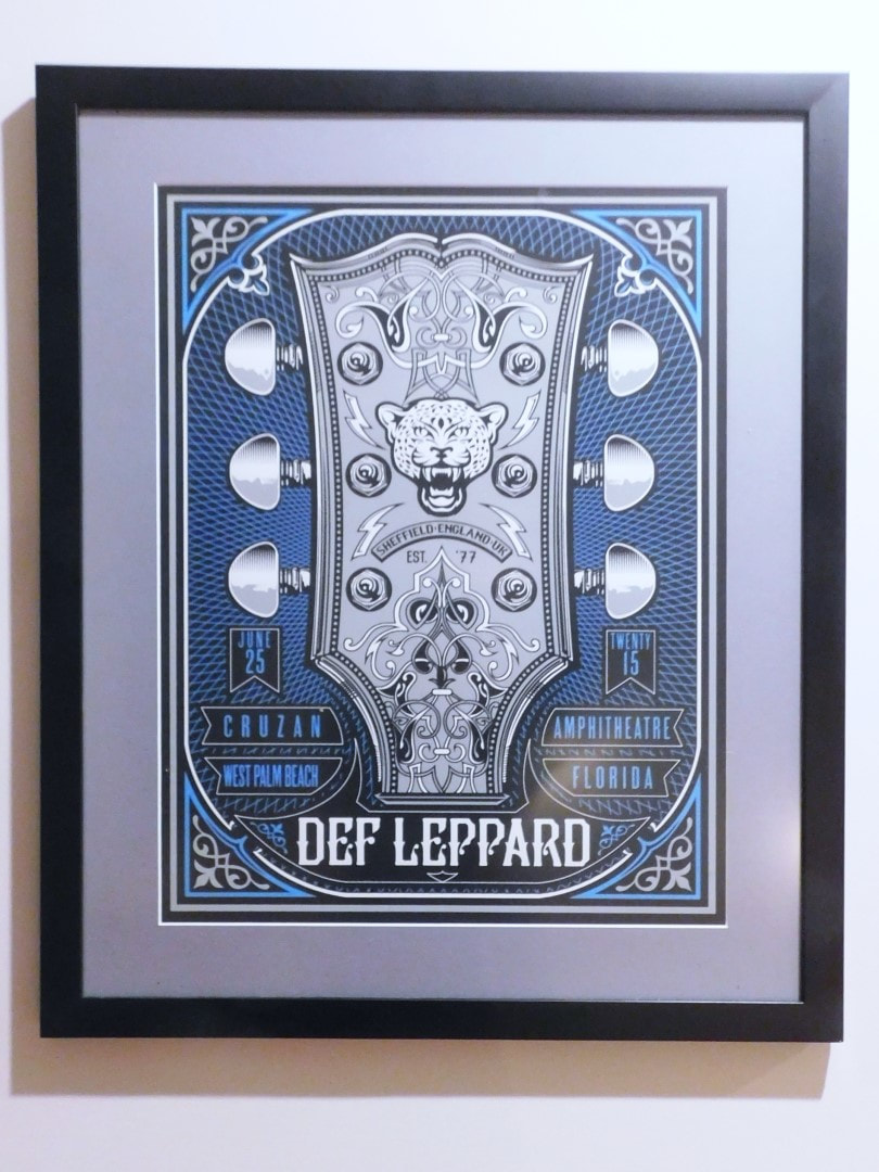
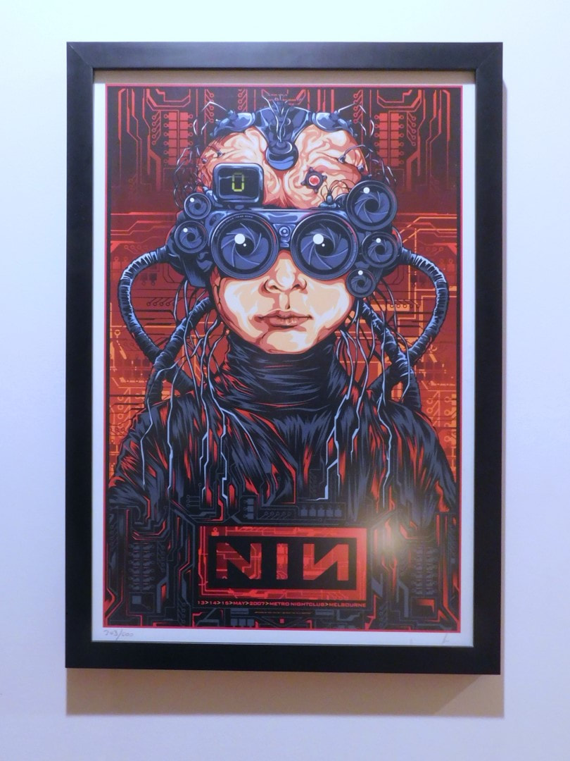
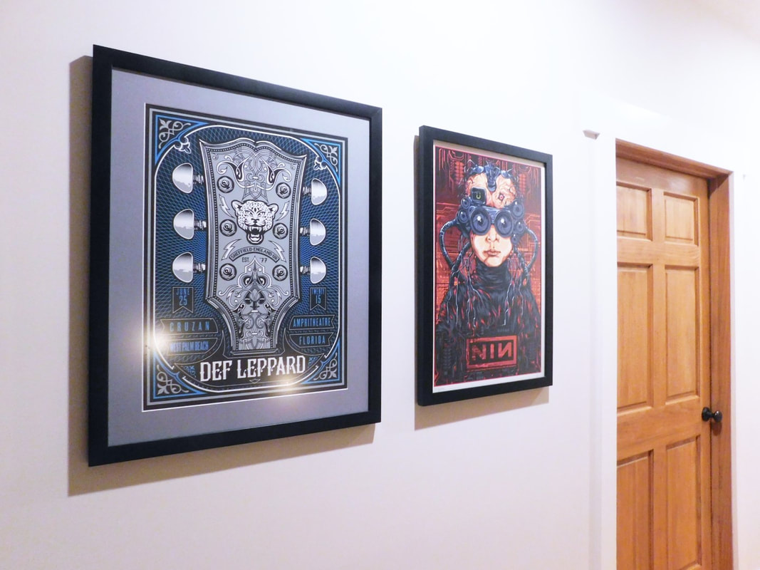
This past Christmas, we showed off a stairwell gallery wall with an old-fashioned, sentimental theme, Now that the new year has arrived, it's time for a more contemporary take on a mosaic art layout with these awesome concert posters. It's hard to get a feel for these on the small screen, but they were incredible examples of the genre and really enjoyable to see together in one collection. I snapped a closeup of the one on the above left because it's the first art I've seen in a long time that's genuinely unsettling when you really contemplate it. (The top of the poster says, "She waits for a new face." Ooky spooky!) This was a nice mix of vintage rock concert posters for bands from the eighties and nineties up through today, and the homeowners already had a marvelous layout for them. I'm not going to spoil the surprise by showing you their whole collage yet... but here's a sneak preview. They had the design laid out on an office floor, so we immediately started cutting templates for the layout. I snapped a few more photos of my favorites. This takes me right back to being eighteen again and frantically dialing the ticket seller's hotline to score tickets for the HFStival. (That was before ordering online was a thing, and you had to just keep redialing until you didn't get a busy signal. Good times.) The middle poster isn't for a band. It's a movie poster; but the first rule about that movie is that you don't talk about that movie. 😉🧼 As I cut the paper templates and gave the frames a quick dusting, Arthur began to lay out the wall. Putting up the paper templates can take quite a while; it's usually two-thirds of the installation time because everything needs to be perfect before we begin to put up the posters. At last we were ready for the magical part: seeing the clients' vision come together on the wall. I really liked the layout they had come up with. As one of the clients said, a good arrangement can make even the weaker pieces seem more compelling because they become part of a larger whole. The "Smashing Pumpkins" poster I showed earlier was the example he pointed out. It was a little bland on its own (perhaps a little too much white space on the edges) but when placed in the bottom left corner of the collage, it flowed naturally up toward the other posters and gave a lifting effect. This wall definitely took an entire day to hang, so I took the final pics at night in poor lighting, but they're still incredible. After we installed the mosaic layout, we helped the clients find a place for their two favorite posters from the collection, which advertised Def Leppard and Nine Inch Nails. I think they had intended to hang these separately, but when we set them side by side, I could immediately feel the sparks fly between these pieces. They both have a similar intensity, yet they are different enough for each of them to hold their own. We put these in a main hallway on the way to one of the homeowners' offices, so she could see it every day on her way to telework. I say this every time, but... I think this is my favorite new project.
However, the reason I love my job is that amazing new art is always waiting right around the corner. Perhaps you have a cherished collection that you'd like to showcase? If so, we would be thrilled to help with placement and installation. Comments are closed.
|
|
CONTACT US
9:00 am to 5:00 pm, M-F 828-649-5242 Owner: Arthur Teel 113 Rector Branch Road Marshall, NC 28753 |

